Reading Time: 7 minutes
Sometimes you see can see those visually pleasing jumping bars when listening to music, which jump higher when the music gets louder. Usually the lefter bars resemble the lower frequencies (the bass), and the righter bars the higher freqs (the treble).
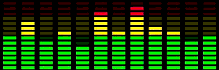
These animating bars are called a visual equalizer, or visualizer. If you need to show a similar visualizer in your Android app, then you can use Visualizer class, which is part of the Android framework, and is attaches to your AudioTrack. It works as expected, but has a major drawback: it requires the permission to the microphone. According to the docs, this is because:
> to protect privacy of certain audio data (e.g voice mail) the use of the visualizer requires the permission
The problem, that users will not give the permission to a music playback app to their microphone (and rightly so). I could not find an alternative way of showing such a Visualizer on Android, like a 3rd party library, or a different Android component, so I started to look into creating one myself. First, I needed to find out how music is turned into the height of each jumping bar.
How does a visualizer work?
First of all, let’s start from the input, music. When digitalizing audio, we usually do a very frequent sampling of the signal amplitude. This is called Pulse-Code Modulation (PCM). This amplitude is quantized, so we find a representation for it on our digital scale. For example, if the encoding is PCM-16, this scale will be 16 bit, so we can represent an amplitude on a number range of 2 raised the power of 16, which is 65536 different amplitude values.
If you sample on multiple channels (like a stereo, you record left and right separately), then those amplitudes follow each other, so first the amplitude of channel 0, then the amplitude of channel 1, then 0 again, and so on. Once we have these amplitude values as a raw number, we can go on to the next step. For this we need to understand what sound actually is (from: Digital Sound and Music):
> The sounds we hear are the result of vibrations of objects — for example, the human vocal cords, or the metal strings and wooden body of a guitar. In general, without the influence of a specific sound vibration, air molecules move around randomly
When you hit a tuning-fork, it will vibrate at a very specific 440 times / second (Hz), and this vibration will travel through the air into your eardrums, where it will resonate at the same frequency, which your brain will interpret as the musical note A.
In PCM, this can be represented as a sinus wave, which repeats 440 times in a second. The height of those waves do not change the musical note, but they represent the amplitude, or as you hear it, the loudness in your ear.
But when you listen to music, it usually is not only the note A you are listening to (I hope) but a plethora of instruments and voices, resulting in a PCM graph which does not make sense to the human eye. This graph is actually a combination of lots and lots of vibrations of different sine waves with different frequencies and amplitudes.
Even a very simple PCM signal such as a square wave is kind of complicated when deconstructed to different sine waves:
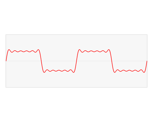
different music illustration in app egeniq
Luckily we have algorithms to make this deconstruction (which is called the Fourier transformation). As you may see in the visualization above, it is actually deconstructed in a combination of sine and cosine waves. Cosine is basically a “delayed” sine wave, but in this algorithm it is very useful to have them, otherwise we would have no way to create a value for the point 0, since every sine wave starts from 0, and multiplying that would still be 0.
One of the algorithms to execute the Fourier-transformation is the fast Fourier transformation (FFT). When running this FFT algorithm on our PCM sound data, we will get a list of amplitudes for each sine wave. These waves are the frequencies of the sound. At the beginning of the list we can find the low frequencies (bass), on the end the high frequencies (treble).
By plotting a bar with the height determined by the amplitude for each frequency, we get the visualizer we wished for.
The technical part
Now let’s get back to Android. First, we need the PCM data of the audio. For this, we can attach an AudioProcessor to our ExoPlayer instance, and it will receive each audio byte before it is forwarded. You can also do modifications, like change the amplitude, or filter out a channel, but we won’t do this now.
In the method queueInput(inputBuffer: ByteBuffer) we will now receive the bytes bundled together as a frame.
These bytes may come as multiple channels, for this I took an average of all the channels, and only forwarded that for processing.
To execute the Fourier transformation, I use the Noise library. The transformation expects a list of floats with a given sample size. The sample size should be a factor of 2, I chose for 4096. Increasing this number will result in a more refined data, but longer calculations and also more infrequent ones (since we can do one update per every X bytes of sound data, where X is the sample size). If the data is PCM-16, then one amplitude is made from 2 bytes. The float values don’t really matter since they scale. If you submit a number between 0 and 1, the results will all be between 0 and 1 (since you don’t need to multiple the sine wave amplitudes with a higher number).
The result will be a list of floats as well. We could plot 4096 bars immediately with these frequencies, but that would be quite impractical. Let’s have a look at how we can improve our result data.
Frequency bands
First of all, we could group our frequencies together into smaller groups. So let’s say we divide the 0–20 kHz spectrum into 20 bars, each spanning 1kHz.
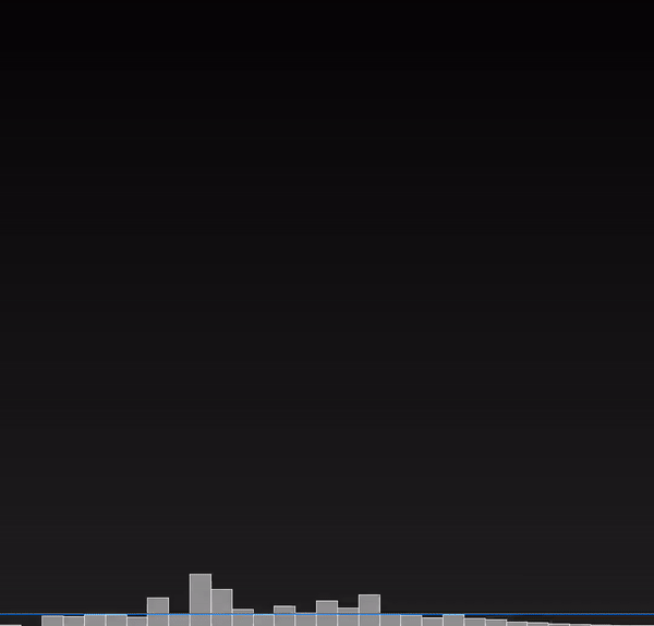
20 bars is a lot easier to draw then 4096, and we don’t even require that many anyways. If you would plot these values now, you would observe that the only the leftmost part of the graph is mostly moving:
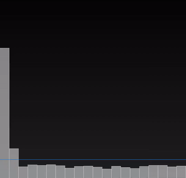
This is because the most “used” frequencies in music are around 20–5000 Hz. Listen to a 10kHz sound, it is very annoying. If you would exclude the higher frequencies from music, you would notice it, it would sound more and more dull, but the amplitudes of these frequencies are just very small compared to lower ones.
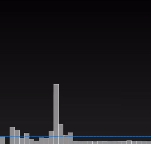
If you would look at a studio equalizer, you can see that the frequency bands are also not distributed evenly. The lower half of the frequencies take usually 80–90% of the bands:

media building in app egeniq
These graphs almost look OK, but there are still 2 issues:
First, the frequencies on the right seem to be moving a bit too much. This is because our sampling is not perfect, and it introduces artefacts called ‘spectral leakage’, where the original frequencies smear into neighbouring ones. To reduce this smearing, we can apply a windowing function, where we highlight our frequencies of interest and tune down others. There are different types of these windows, but I will be using the Hamming-window. Our frequencies of interest are the frequency bands in the middle, and as we get to each end, our interest will be lower:
Finally, there is one annoying thing which you can not see in the gifs above but could immediately notice when you also hear the music: the graphs are too early, they jump when you wouldn’t expect to.
An unexpected buffer
This out-of-sync behaviour is because in the ExoPlayer AudioProcessor we receive the data before it is passed onto the AudioTrack, which has its own buffer, which delays the output.
A solution to this was to copy the buffer size calculation part over from ExoPlayer, so I have the exact same buffer size in my processor as the AudioTrack has.
I put the incoming bytes at the end of the buffer, and only processed the bytes at the beginning of the buffer (so a FIFO queue), which delayed the FFT exactly as much as I wanted to.
Final result
I have created a repository in which I showcase my FFT processor by playing an online radio, and plotting with the visualizer I have created. It for sure is not production-ready, but it might give a good basis if you were looking for a visualizer for your music playback app.